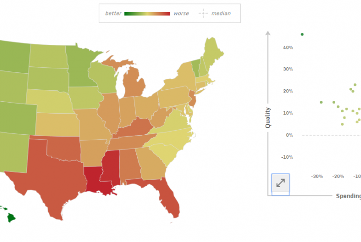
To view the relationship between health care quality and spending in your state or local area using the most recent data as of June 2017, use the graph, known as a scatter plot, or map. Choose a health care setting, such as hospitals, and then a quality measure to view performance. Curious about how your region compares to someplace else? Click on your selected location and then drag your mouse to the state or local area you want to compare it to and hover. You can see which location has lower spending and higher quality relative to the U.S. median. Use what you learn to motivate improvement toward higher levels of performance. Share your views of it with us at [email protected]. For information about methodology and scoring, read our FAQ.
Quality-Spending Interactive, June 2017 Update
Publication Details
Date
Area of Focus
Topics